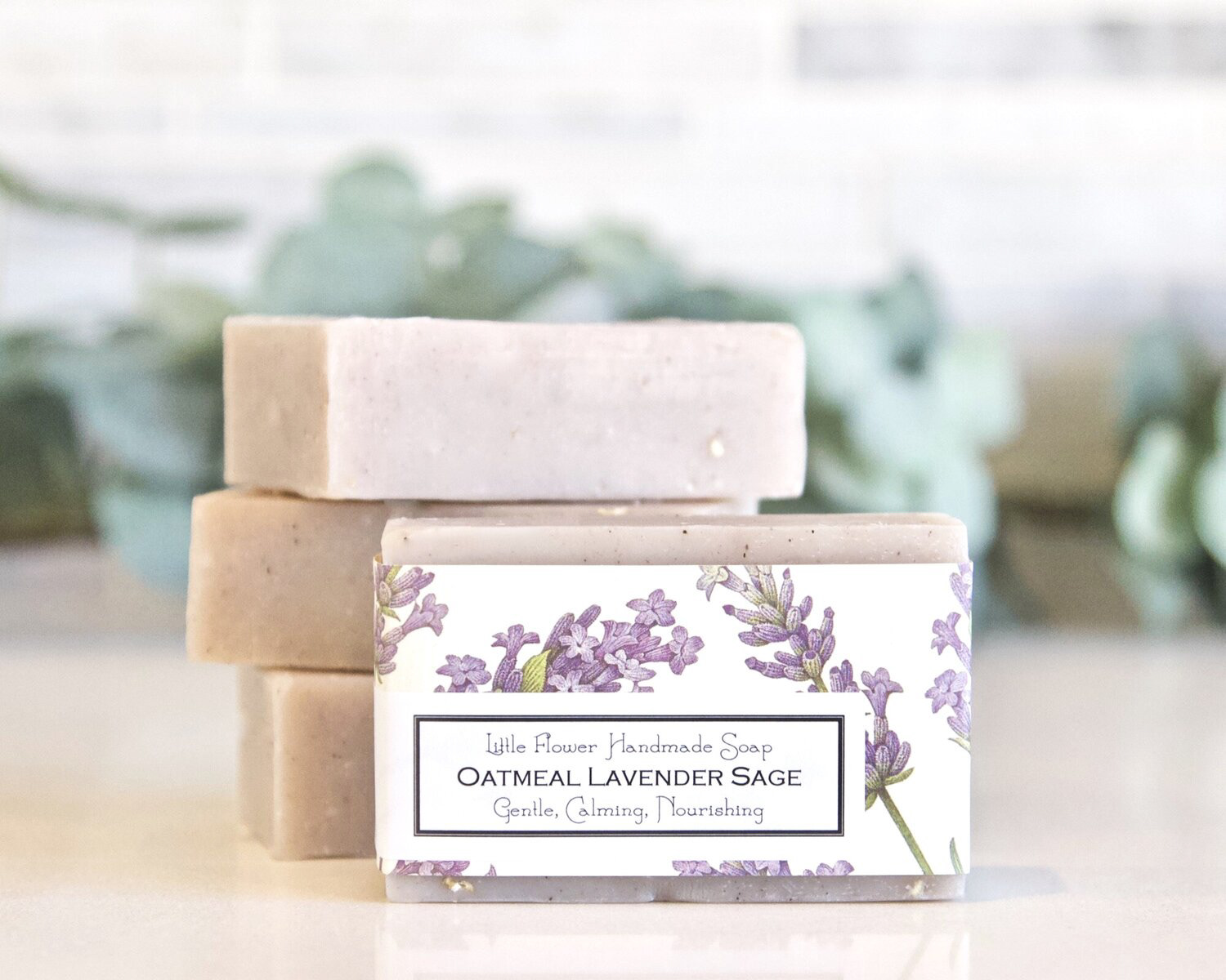
The Little Flower Soap Packaging
For this packaging, I wanted it to be feminine. From the logo, down to the color palette, I wanted it to feel like it belongs beside the sink in someone's super cute, farmhouse kitchen or bathroom. To accomplish this, I chose a muted palette with earthy tones, and I used watercolors to create a soft and imperfect painting of oatmeal, lavender flowers, and sage leaves. I also chose to print on textured paper to amplify the soft vibe.
The Original
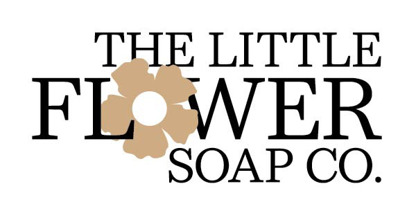
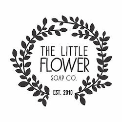
my logo
The Original
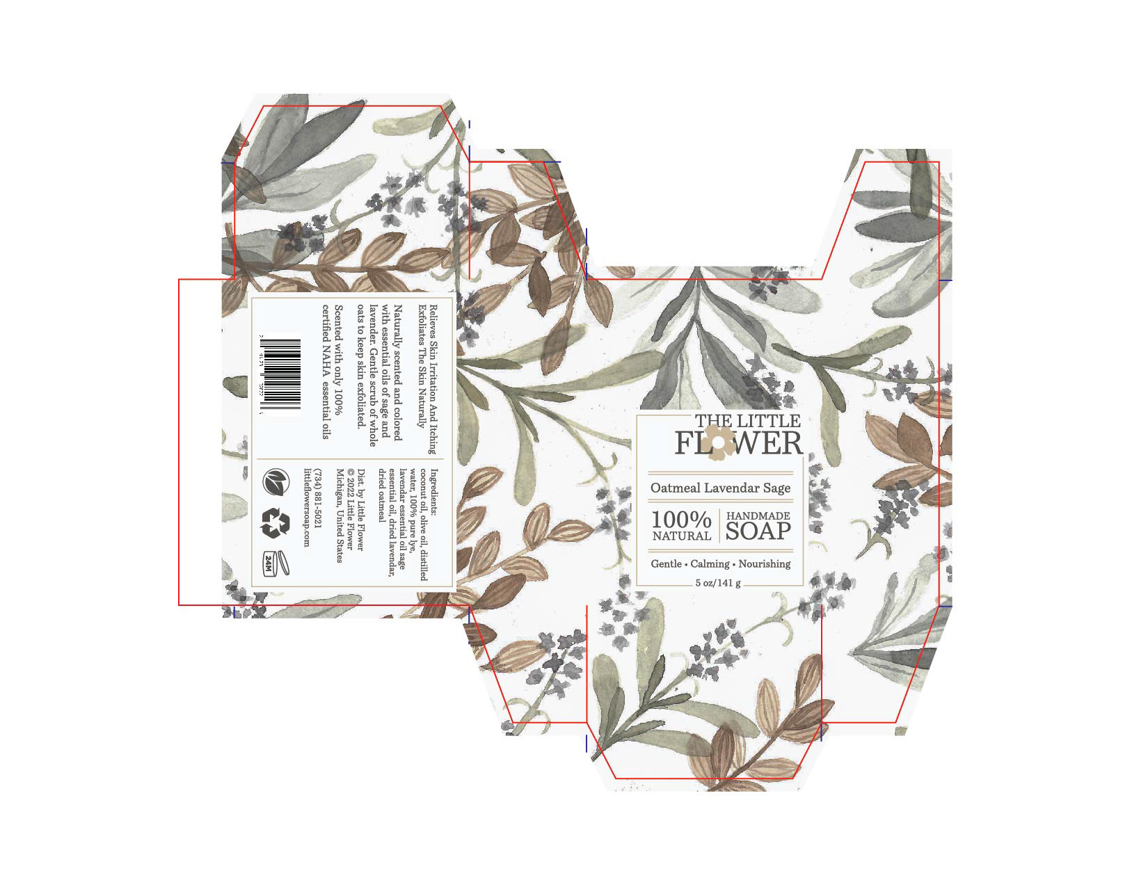
MY package